Stéphane Luchini, Patrick Pintus and Miriam Teschl share their views and research findings on the economics of epidemics, testing, health.
The keynote of the current COVID-19 pandemic is uncertainty. Who could have known in early January, that by mid-March, most countries in the EU would opt for a generalised lockdown, and that borders would be closed within the Schengen. Now, as we slowly approach the end of generalised lockdown periods in many European countries, all we can say with certainty is that we don’t know whether the worst is behind us, or whether there will be a second wave of infections to bring public life at least partially to a hold. And yet, most public decision-making over the past months has relied on epidemiological models that, of course, had to start somewhere: that is, with assumptions.
In “normal” times, discussing the correctness of assumptions can be quite a pleasant pastime, in particular among economists. However, in the current situation, it would have been, and still is, fruitful to rely on the actual data available rather than on assumed probabilities. The purpose of using actual data, however, is not to count the number of people infected or cured, but to help visualise any acceleration or deceleration of harm. That is, what matters in times of radical uncertainty is to enhance understanding of the dynamic of the pandemic in real time, by offering a way to indicate when the pandemic is spreading rapidly and when it is slowing down (Luchini et al. 2020).
To do so, we propose an indicator that looks at whether the relationship between the number of positive cases over the number of total tests presents a convex or a concave trend (Baunez et al. 2020a). The intuition behind this relationship is simple: if with an increasing number of tests more and more people are found to be positive, the pandemic is spreading rapidly (convexity); if less and less people are found to be positive with an increasing number of tests, the pandemic is under control (concavity). Two important corollaries can be drawn from this: first, massive testing is crucial; second, whatever the public health policy chosen, the aim should be a concave relationship according to this indicator.
Obviously, the more local this indicator is, the better it will illustrate geographical variations. As this indicator is fed daily with the newest data, it can relatively quickly indicate any changes in the dynamic of the pandemic and can therefore easily be used for local trial-and-error policy. A third corollary therefore is that different policy responses, across regions within a country but also across countries, can better be observed and compared. The most sensible idea here is to have an open-access data-dashboard that helps compare policy responses across countries via this indicator, so that the most effective policies can be applied elsewhere as much and as rapidly as possible.
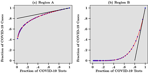
To represent how our indicator works, we use a scatterplot of the cumulative number of positive cases against the cumulative number of total tests.
Figure 1

In Figure 1, we draw the hypothetical scenario of two regions, A and B. The curves are normalised by dividing raw data over the last data point available today. Comparing these two regions, we find that with the same fraction of tests, there are initially more positive cases in region A than in region B, but this trend is reversed as the fraction of tests increases at end date. This representation also tells us something about efficient distribution of tests (Baunez et al. 2020b). Tests, are a scarce resource and the best possible distribution is therefore crucial. Intuitively, we can say that tests are better used in a region where the pandemic is accelerating than where it is slowing down, because with the same number of tests, more positive cases can be found in regions where the harm is increasing more rapidly.
Graphically, this means that tests should be distributed across regions or countries according to the slope of the tangent on those curves, as in Figure 1, which can be interpreted as the marginal benefit of an additional test at end date. For example, at endpoint, the slope of the tangent to the curve in region B is steeper than in region A, indicating that more tests should be attributed to this region so as to curb the pandemic. A positive test result enables the concerned person to be isolated in order not to infect others, thereby contributing to a deceleration of the spread of the disease. This shows that, albeit quite counter-intuitively, tests should not be allocated to regions with the highest number of cases, but to those where harm from the pandemic is accelerating. Policies like this require the right indicator, not just any simple time series or fancy models based on assumptions easy to get wrong in times of uncertainty. Our indicator does this job. And it shows that ready-to-use research does not necessarily need to be complicated and assumption driven.
REFÉRENCES :
Baunez, C., Degoulet, M., Luchini, S., Moatti, J.-P., Pintus, P., Teschl, M. (2020a), “Urgently Needed For Policy Guidance: An Operational Tool For Monitoring The Covid-19 Pandemic”.
Baunez, C., Degoulet, M., Luchini, S., Pintus, P., Teschl, M. (2020b), “Sub-National Allocation of COVID-19 Tests: An Efficiency Criterion with an Application to Italian Regions”, Covid Economics: Vetted and Real Time Papers, CEPR Press, Issue 12, pp. 192-209.
Luchini, S., Degoulet, M., Baunez, C., Pintus, P. (2020), “Detecting Acceleration of the COVID-19 Pandemic for Policy Guidance”, AMSE DialogEco Eclairages, March 20th.
→ This article was issued in AMSE Newletter, Spring 2020 - Special edition on Covid-19 Crisis.


